Colors are
a ubiquitous fact of human life. Imagine a world without colors; all of the
great masterpieces would be painted in gray scale, that potato could be purple
or brown and there would be no more blue skies. Experientially, we are highly
familiar with the concept of colors, but I would say it isn’t common to
understand the more technical side of the world of colors. Let’s explore this
more analytical side and it’s applications as we try to answer a question most of
us have probably had: why are there multiple sets of primary colors?
At the
most basic, colors are categories of light within the visible spectrum that can
be described as having either different wavelengths or frequencies since the
two variables are directly correlated by the equation
1. c=λv (c is the speed of light, λ is wavelength and v is frequency)
The visible spectrum is comprised of the rainbow colors
describe by the acronym ROYGBIV (red, orange, yellow, green, blue, indigo and violet).
Fig. 1: Visible spectrum for humans (Arstechnica)
 White is the presence of all wavelengths while black is the absence of
light. Technically, there is no physical meaning associated with colors since the color spectrum is defined based on
human capacity to perceive and differentiate different colors. That is to say,
the visible spectrum and colors would be defined very differently had we been
insects able to see UV light [1]. So keep in mind that all of this talk of analyzing
colors is human-specific and don’t go off trying to explain it to your dog.
White is the presence of all wavelengths while black is the absence of
light. Technically, there is no physical meaning associated with colors since the color spectrum is defined based on
human capacity to perceive and differentiate different colors. That is to say,
the visible spectrum and colors would be defined very differently had we been
insects able to see UV light [1]. So keep in mind that all of this talk of analyzing
colors is human-specific and don’t go off trying to explain it to your dog.
Fig. 1: Visible spectrum for humans (Arstechnica)
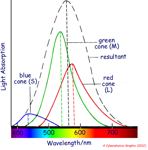
The human
eye consists of rods, which perceive low intensity light, and cones, which
perceive colors and high intensity light [2]. There are three types of cones,
dubbed L, M and S, that respond to different wavelengths of light. The peak sensitivities
for these three cone types are 580nm (red), 540nm (green) and 440nm (blue)
respectively, adding to a maximum sensitivity at 560nm (in the yellow-green region
of the spectrum) [3].
Fig. 1: L, M and S cone response curves and response sum (Cyberphysics)
 This should start to sound familiar for those of you who are familiar with the concept of primary light colors or who have ever squinted really hard
at a television screen. Aside from these three colors, other colors are
perceived by simultaneous stimulation of multiple cone types. The color mixing
ratios of red, blue and green light to perceive every color was actually
indexed in 1931, creating the RGB CIE 1931 system [4]. The impact of breaking
each color into three values of red, blue and green, called the RGB tristimulus
values, is that each color can now be defined in three-dimensional space as a
combination of three basis vectors representing red, blue and green relative
intensity values. The mathematical derivation can be found in reference 4, but
the result is the chromaticity diagram familiar to aficionados of tech wanting
to know what range of human-perceivable colors their devices are capable of
displaying. Look along the edge of the chromaticity diagram and you should find
a color wheel for light.
This should start to sound familiar for those of you who are familiar with the concept of primary light colors or who have ever squinted really hard
at a television screen. Aside from these three colors, other colors are
perceived by simultaneous stimulation of multiple cone types. The color mixing
ratios of red, blue and green light to perceive every color was actually
indexed in 1931, creating the RGB CIE 1931 system [4]. The impact of breaking
each color into three values of red, blue and green, called the RGB tristimulus
values, is that each color can now be defined in three-dimensional space as a
combination of three basis vectors representing red, blue and green relative
intensity values. The mathematical derivation can be found in reference 4, but
the result is the chromaticity diagram familiar to aficionados of tech wanting
to know what range of human-perceivable colors their devices are capable of
displaying. Look along the edge of the chromaticity diagram and you should find
a color wheel for light.
Fig. 1: L, M and S cone response curves and response sum (Cyberphysics)
So far we have one set of primary colors consisting of red, blue and green that has widespread applications in electronic
devices since many of these generate colors for humans to perceive when watching
movies or reading billboards and such. But this set of primaries and its corresponding
wheel only apply to the production of light by adding ranges of wavelengths
together. This is called additive color. When light is absorbed by colored materials via
quantum effects, as has been described in Thoughts in Black Ink, the color perceived is the light range that has not been absorbed. To describe the phenomenon of light
absorption to generate a reflected color, the painter’s wheel was invented by
Isaac Newton in 1666 [5] with the familiar primaries of red, blue and yellow. What
this wheel describes is how subtracting light with certain ranges of wavelengths
stacks to reflect light of a certain color when starting with ambient pan-frequency
white light. However, this is not strictly subtractive color because the
painter’s wheel adds to brown, not black as anyone who has tried to make black paint
from the primaries in art class knows. The subtractive color wheel is defined
with yellow, magenta and cyan as primaries and should be familiar as the
different ink cartridges you probably put in your printer so that your computer
can print black in theory (but black ink is cheaper).
Fig. 2: Additive and subtractive color (Mac Developer Library)
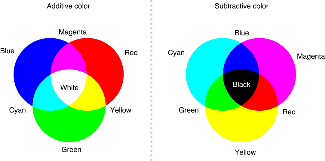 Why these three colors? It
turns out that if you take the three primary colors of light, red, blue and
green, and combine them two at a time, you get cyan, magenta and yellow [6]. And
since the color of a surface is what the surface doesn’t absorb, each
subtractive primary color cancels out one of the additive primary colors until
no light is left. And there you have it, the three most common primary color
sets.
Why these three colors? It
turns out that if you take the three primary colors of light, red, blue and
green, and combine them two at a time, you get cyan, magenta and yellow [6]. And
since the color of a surface is what the surface doesn’t absorb, each
subtractive primary color cancels out one of the additive primary colors until
no light is left. And there you have it, the three most common primary color
sets.
Fig. 2: Additive and subtractive color (Mac Developer Library)
This post was made in response to a comment by my friend Lilia back on the article How Soap Helps Us Clean. I haven’t address the comment until now because I knew there would be a biological component to this explanation and cellular biology is not my strong suit, hence the brevity with which I describe the rods and cones of the eye. But if you guys have anything you would like to hear about, feel free to leave suggestions in the comments below and I will do my best to write a post for you. Thanks!
No comments:
Post a Comment